Visual Mastery: Elevating github with Impactful displays
Published on 9/11/2023
I am a budding web developer, and just like me, many other developers use GitHub as their go-to platform to manage and store their codes. Some more professional coders might be using Bitbucket, Gitlab, Azure DevOps, etc. But perhaps they will also agree with me that the UI/UX of GitHub is more the reason to get attracted towards it every time.
The greatest value of a picture is when it forces us to notice what we never expected to see.
Since GitHub is used by many people who wish their profile looks more engaging & attractive so that the visitors get impressed every time. I myself want the same for my GitHub Profile so I began searching and exploring different Github profiles that look professionally amazing, and found a smorgasbord of graphs, videos, and all kinds of visualization tools.

So, In an unorganised manner here are the things that I found use-worthy
- Github Isometric Contributions
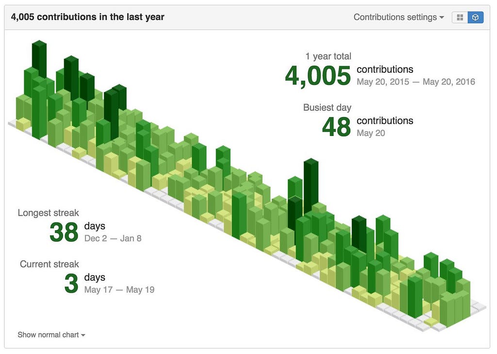
This is a Chrome extension that visualizes your GitHub contributions graph and creates an isometric 3D pixel view of the public data on your profile. Just add the extension to your Chrome browser, reload the browser, and open your GitHub profile, you will be able to see the 2D/3D option on the top-right of your contribution chart and it works like a charm.
— get the extension
2. GitHub Wrapped
Source · Create your own
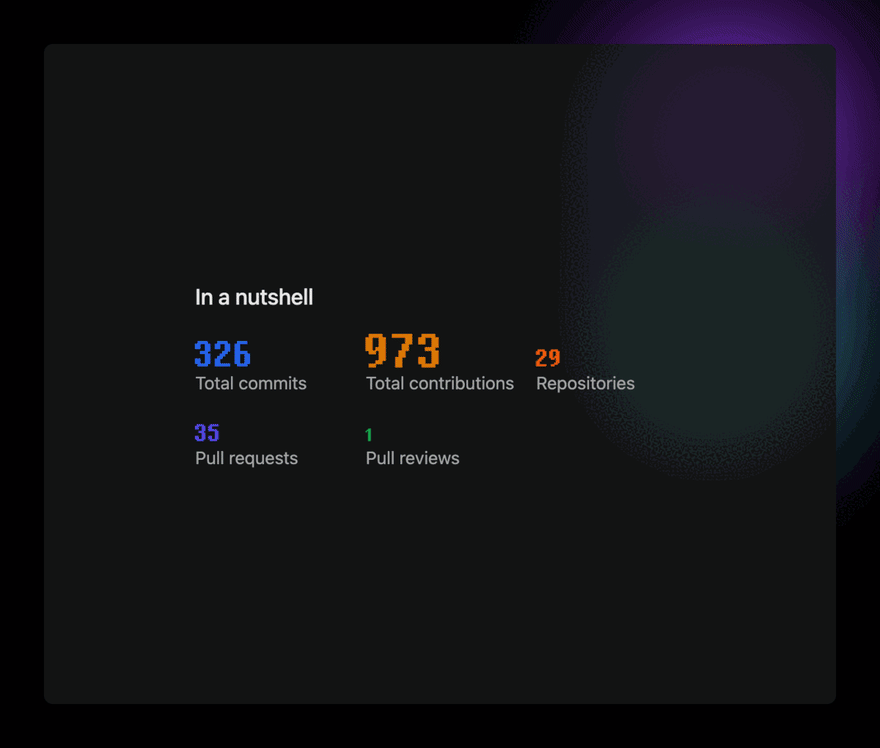
Created by NEAT — A desktop inbox of GitHub notifications for your desktop Menubar on macOS & Apple silicon-based Macs. A little app that shows the total number of commits, contributions, stars — given and received, etc. The images and graphics generated look great on the GitHub readme.
3. GitHub Unwrapped
Demo · Source · Create your own
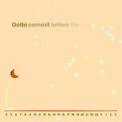
Looks like some Christmas celebration in here. Github unwrapped is an amazing, fun way to display your profile activity. It shows what time and date of the week you were most productive and also displays the issues you opened and closed on a Christmas tree.
You can learn more about it on Twitter, just use the #githubunwrapped on Twitter.
4. GitHub Trends Wrapped
Demo · Create your own
Lines of code changed, Bar charts, Scatter Charts, Weekend Activity, daily, weekly, monthly contribution charts…….
phew! do I need to mention more features or will you care for some self-assistance? This tool has all these things and many more.
Probably this is what your pointy-haired boss will be looking for when reviewing your performance if you’re cursed fortunate enough to face meet them.
Echo: hopefully not!
Ok! Time for some 3D tools:
5. GitHub Skyline
Demo · Create your own
Looks like some sci-fi movie’s generic computer screen. Skyline provides an amazing 3D wave-ish model that looks like the new york skyline (maybe, hence the name!). It is viewable in your browser, but unfortunately, you cannot use it in your GitHub profile for obvious reasons.
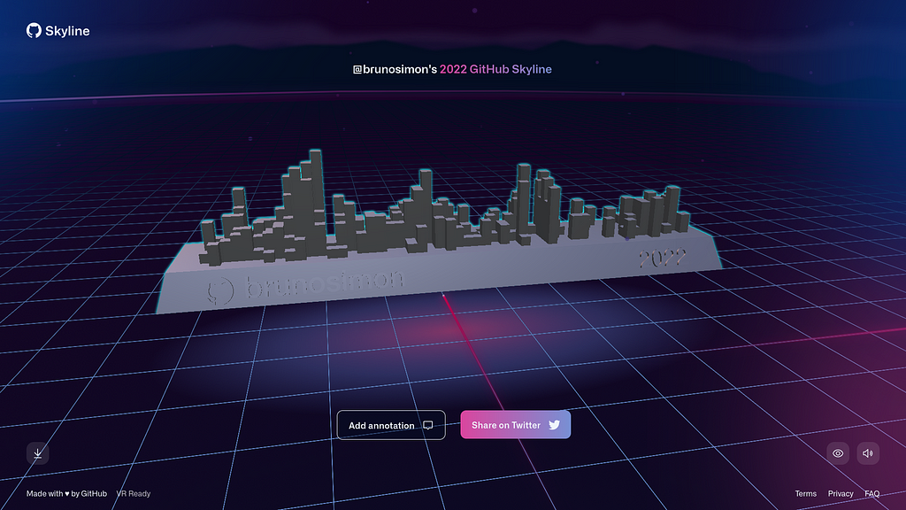
Don’t worry! If you feel like bragging about your amazing contributions to people, just download the .stl file and print it on a 3D printer. A perfect decoration, a prop for your desk setup, or Mantelpiece.
Lars Gyrup Brink Nielsen @LayZee@mastodon.nu on Twitter: "My year in code #GitHubSkyline pic.twitter.com/EOMX7pLbzz / Twitter"
My year in code #GitHubSkyline pic.twitter.com/EOMX7pLbzz
6. GitHub Cities
Demo · Create your own
You shouldn’t build a city with sticks and stones, neither should you build it on someone’s contribution graph.
The GitHubCity project aims to visualize the geographical distribution of GitHub users and their activity on a world map. It is developed & managed by “honzaap” using three.js.
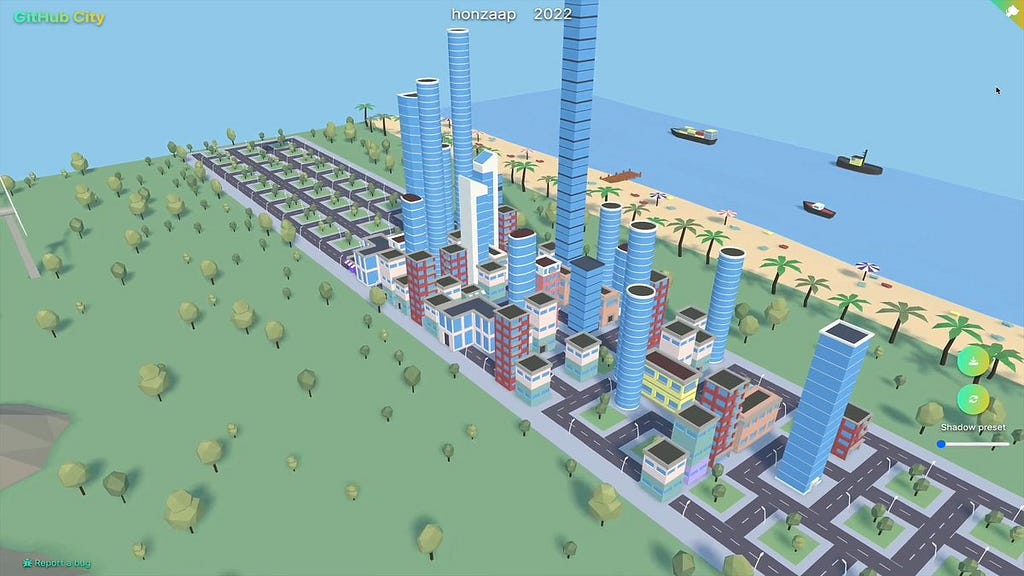
Pro tip: Please add some NPCs to make it more fun while using like a controllable car or maybe some birds.
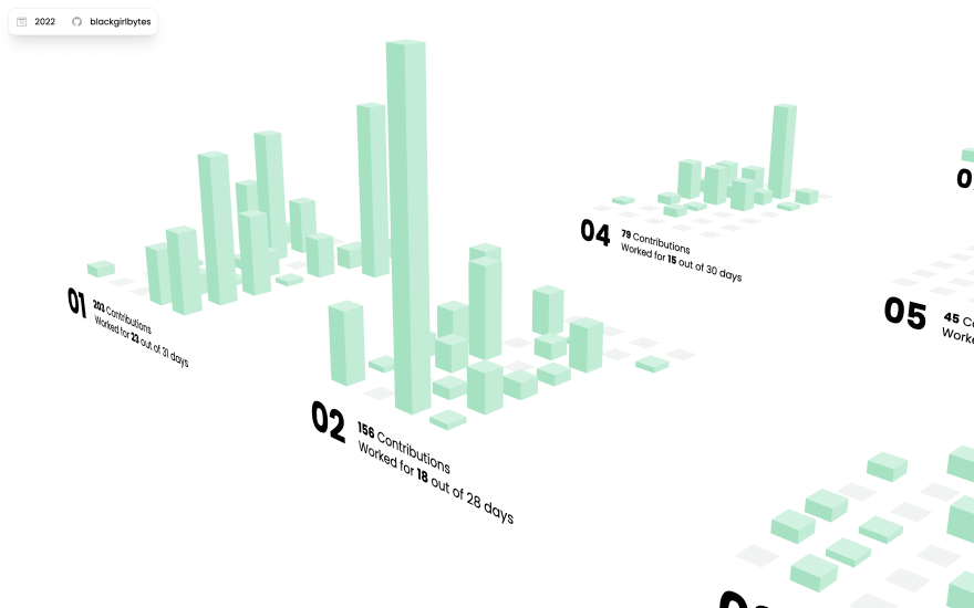
7. GitHub Town
Demo · Create your own
@mornhee got inspired by the above two projects so much that he created a kind of combination of both and made this awesome-looking 3D scene where months are represented by blocks & contributions are represented by skyscrapers.
fun fact: @mornhee also uses Github Isometric Contributions in his GH profile.
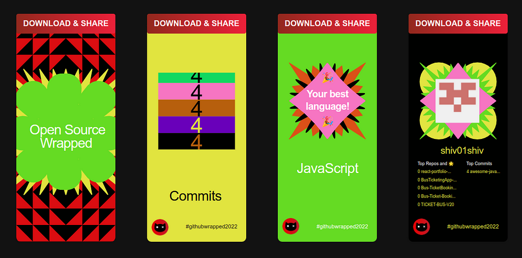
8. Open Source Wrapped
Source · Create your own
A spotify wrapped cameo to open source development made by @schrodinger_hat. Just download the Images and maybe set them as your mobile phone background if you feel like doing it like me.
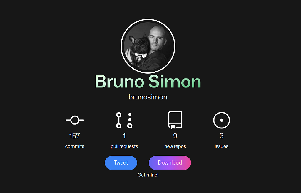
9. GitHub Wrap App
Demo · Create your own
App made with Next.js & Tailwind using Mono sans font, It generates a portrait like summarization of your GitHub activity. Maybe now that empty photo frame of yours will not be so empty, or use it as your phone’s background if you are a fan of dark themes like me.
10. GitHub Contributions Chart Generator
Source · Create your own
Here’s a splendid opportunity for you to provide your esteemed GitHub username, allowing this magnificent generator to bestow upon you a year-by-year breakdown of your contributions from the inception of your account until this very moment.
yeah! I know, It’s an exquisite chance to take a leisurely stroll down memory lane and regale yourself with nostalgic tales.
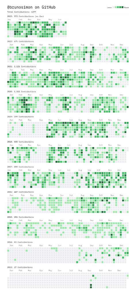
Protip: Should you possess a penchant for engaging in visualized data manipulation, do consider availing yourself of the JSON-formatted data located on the web page’s inconspicuous link situated discreetly in the lower left corner. It’s akin to an enigmatic treasure awaiting its grand unveiling!
Now, how about a touch of personalization?
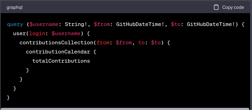
11. Building your own Github Activity Visualizer
There is a little something called GitHub GraphQL API, where a simple query run like the one below can be used to obtain the graph of contributions for a given period.
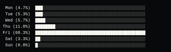
12. Chartscii weekly chart
ChartSCII is a command line tool that allows you to generate ASCII charts according to your need and designs. Just install it using the Instructions from the repository https://github.com/mkaz/termgraph.
Probably you may find the instructions on how to use it: Still I will tell you how I did it.
Install ChartSCII: npm install -g chartscii
Retrieve weekly data from GitHub Rest API using a personal access token:
curl -H "Authorization: Bearer <YOUR_ACCESS_TOKEN>" \
     "https://api.github.com/repos/<USERNAME>/<REPO>/stats/participation"
Format the data into an array of objects, each containing a label and value.
run `chartscii <chartData>`
example of API response:
const response = {
  "all": [2, 5, 8, 4, 6, 2, 1],
  "owner": [1, 2, 1, 3, 2, 1, 0]
};

const weeklyActivity = response.all;

const chartData = weeklyActivity.map((value, index) => ({
  label: `Week ${index + 1}`,
  value
}));

chartscii '[{"label": "Week 1", "value": 2}, {"label": "Week 2", "value": 5}, ...]'
The chart might look like this:
13. Honorable Mentions
The ones that are going to be mentioned below are also pretty amazing tools but honestly, I didn’t find them that good compared to the above ones. So, here are some honorable mentions —
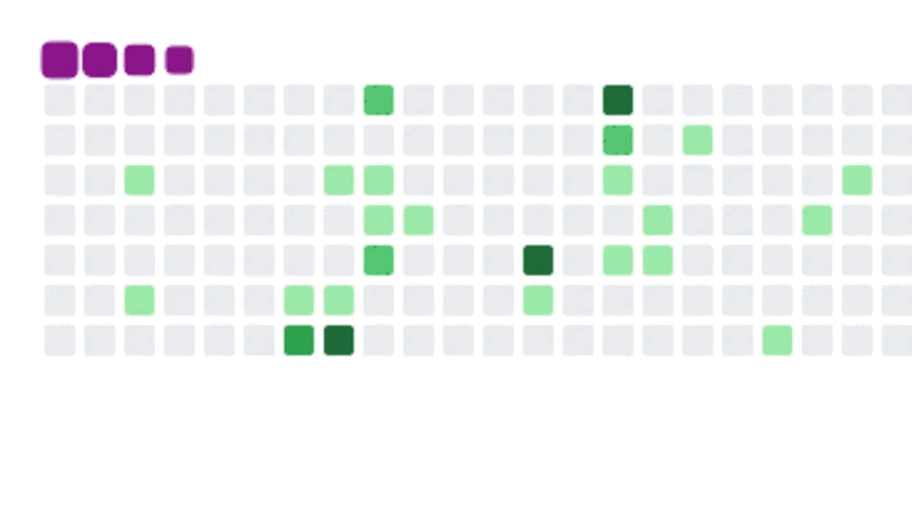
- snk: yeah! I know quite the gen-z name for a tool but you may be able to get an idea about what is it gonna be. correct :D It’s a snake but not a game that you can play. This snake will hiss…. around your contributions to keep them in a boundary.
That’s it for now! BTW this was my first ever blog, if any mistakes or any suggestions the professionals would like to give, they are most welcome. I hope you enjoyed the read, a clap would be appreciated. Cheers!